Getting the Best from your Web Developer
Posted on:
Previously we talked about how to select a great web developer, and today we look at what to do when you have found one! When you start the discussion with your web developer, you are starting on an exciting process. To get the best from your developer, you need to do a little preparation. As a website is a creative endeavour, making sure you are on the same page is critical to a great outcome.
Prepare for your consultation with your web developer by doing some research.

A great first step (either before or after you’ve selected your web developer) is to spend some time looking at other websites, especially of competitors or similar companies.
What websites can you find that you like (or dislike)?
Look for websites that you don’t like as well as for ones you do like. If you can explain what you dislike, your web developer will avoid those pitfalls and excel where you want them to.
Spend some time looking at other websites, especially of competitors or similar companies. What do their websites do well? How is the information presented? Is it attractive and make sense? If it doesn’t make sense or you don’t like it, what do you dislike about it? Put together at least three links to your website developer to start discussions in the design phase.
When you’re looking at competitors, keep in mind what features they have that you hadn’t thought of. Maybe they have an online store, or an automatic booking system or chat functionality, some other feature that might improve your website that you hadn’t thought of.
Also consider the branding on their websites. Have you developed your own brand style and guide? It’s useful to do this before starting a website build, but ask your web developer as their designer might be able to assist with this or they might have someone they can refer you to.

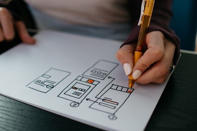
Each web developer will have a different process for how they start building a website, but most of the time they’ll start of by drawing a wireframe. This gives you an idea of what the structure of your website is going to look like and sets the foundation for the final design.
A wireframe is basically a skeleton drawing of your website.
You’ll likely end up with a wireframe for each unique page on the website (eg. home, blog, standard), as they’re a template so it’s ok if the exact content isn’t the same. As the client, you can draw it on a blank piece of paper, and give that to your developer to give them an idea of what you’re looking for.

Once the wireframe is completed, then they’ll typically move on to doing a fully fleshed design. This involves taking the wireframe and adding your branding and style, building it out into a fully fleshed page design. This probably won’t include a design for every page, but should include each of the different pieces of your website so your developer can put them together when building it.
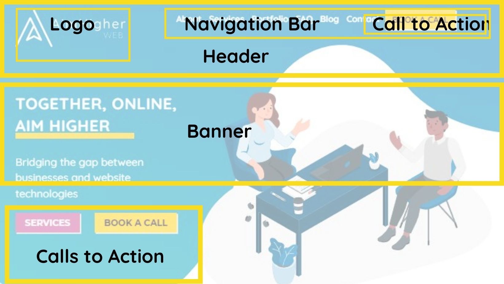
Websites have lots of moving parts, but there’s a few bits and pieces that most sites will have in common. Don’t worry if you haven’t heard of something, there’s new things being created on the web every day!
- Logo
- Navigation Bar
- Header and Footer
- Call to Action buttons
- Banner Image or section
- Page Content
- Gallery
- Contact form
Some parts of the website will be the same no matter what page you’re on, usually the header and the footer, as this creates continuity of experience, and users know what to find where. As western audiences “read” a page from left to right and top to bottom, your logo is usually at the top left corner as this is the first place people will look. If your audience is different, that may change, for example if your audience is primarily Arabic speakers, you’d likely have the logo at the top right of your website as they’ll read from right to left.
Your website design will change depending on what language your users speak and if they read left to right, or right to left

As it’s the first thing people see, your logo should be attractive and well designed, but shouldn’t be too overcomplicated. The rest of the header can then contain navigational links, important call to action buttons and other information like search boxes or phone numbers. It’s best to think of the header as the Home section for when a customer gets confused. They will look to the header to re-orient themselves, or to learn more about you and your company.
If you run an ecommerce site, your shopping cart and login/logout buttons will also be in the header so they can be easily found
On the homepage in particular (but likely on other key pages), the banner will be the first thing people see when they visit the page. Your developer/designer will guide you on what needs to go there, and might give recommendations for images/graphics but their job is not creating your content (although they may be able to provide recommendations for content writers). Any images that appear here should be something that fits within your brand and is meaningful, if it’s not then it’s safer to leave the image off and let the words speak for themselves. As AimHigher is a professional consultancy service, the image in our banner is neat and professional, but it’s graphic style is in keeping with our branding and isn’t completely corporate (again, similar to our branding and values). If you’re relying on a stock image for this section, make sure you choose wisely, and try to avoid any images that look too “posed”.

Congratulations on continuing your journey and finding a web developer that works for you! A good developer can do some amazing things for you and your website, so chat with them today to get started.
